Integration of mixing local tastes and global lifestyle with Kansai
[vc_row][vc_column width=”2/3″][vc_single_image image=”4698″ alignment=”center”][/vc_column][vc_column width=”1/3″][/vc_column][/vc_row][vc_row][vc_column width=”1/3″ el_class=”infocolum”][td_block_text_with_title custom_title=”Information” el_class=”sinfo”]
Kansai Paint
Address:
4, Solok Waja 2, Kawasan Perindustrian Bukit Raja, P.O.Box 159, 41710 Klang, Selangor, Malaysia.
T: +603 3362 2388
[/td_block_text_with_title][/vc_column][vc_column width=”1/3″ el_class=”newspost”][vc_column_text]Embracing the theme Kansai Paint Colour Forecast of ‘global trends, local style’ it is the integration of mixing local tastes and global lifestyle that makes it easy to tackle your next décor project with confidence. Color have the gift of changing your mood in an instant and uplift your space, so discover the latest color trends that can bring the best out of you.
Every year Kansai Paint research team put together the Colour Forecast to help people decode the world of color trends and how it can improve their aesthetic surrounding whether be it at work or at home. Currently we’re seeing that our world is in flux, and this means that our trends are all about bringing different design, cultural and lifestyle influences together in unexpected combinations.
So we hope that through this research findings you will be able to find inspiration first and foremost, but also a resonance in your own life. Color is more than what is on the surface. It affects our mood and shapes our world, and this Forecast is our snapshot of where we are right now.
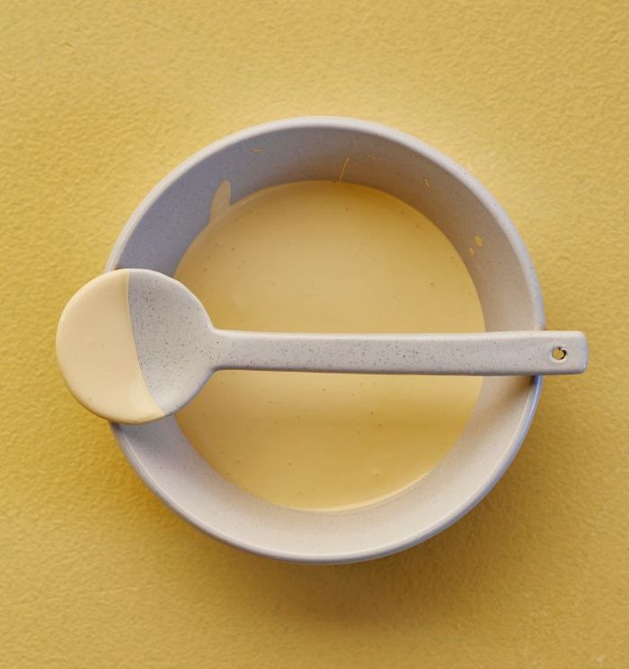
NEUTRAL OF THE YEAR – AMADEUS (Y2-B1-4)
This year, we’ve done things differently by introducing a Neutral of the Year into the Forecast. It’s our favorite color pick that best captures the essence of the year’s trends and is really easy for anyone to use. Amadeus is an earth, yellow-tinted hue that helps to bring a space together. It’s a neutral with character which brings a grounding energy when you match it with other colors.

Neutral of the year – Amadeus (Y2-B1-4)
EXOTIC EUPHORIA
The distinction between natural and artificial is starting to blur as scientists, designers and artists combine the best of both in their work. The result is a new kind of visual expression where colors are supercharged and a little wild. In this palette, city nightscapes and phosphorescent jungle life inspire a range of blazing bright, which are complemented by a selection of lush natural hues.

Exotic Euphoria
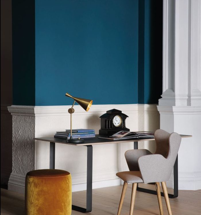
SOFT COMPOSITION
Soft Composition is about editing spaces and styles to create room for contemplation. It draws on the forms and colors of the past but updates them to create a calming yet grounded experience. With a purposeful palette of muted colors and bold retro accents, Soft Composition feels familiar yet contemporary. It is a modern, warm minimalism for the way we live today.

Soft Composition
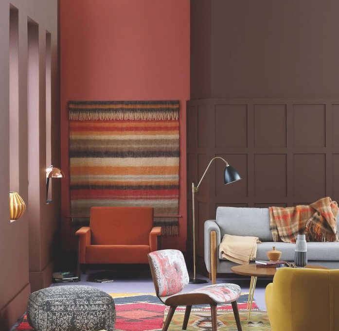
CRAFT SPIRIT
We live in a world of infinite inspiration through connection, but the more we explore our world the more we find common colors are the ties that bind. Craft Spirit pays tribute to this rich global mix with a grounded and pigmented palette of warm burnished hues, fruity accents and watery blues. We all have a link back to a crafted past and rediscovering and remixing that is key today.

Craft Spirit
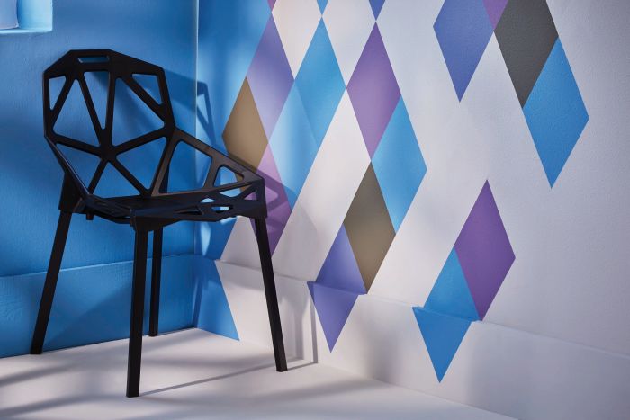
HI-GLO
More and more, our identities are about pushing boundaries. People long for spaces where they can play with their personal expression. This rulebreaking spirit, plus a less serious approach to interior leads to quirky color choices and the exploration of fun, digitally- inspired design. We’ve captured this all in a palette of sorbet tones of lemon, lime and pink, paired with mid-tone primaries and grounding earthy colors.

Hi- Glo
[/vc_column_text][/vc_column][vc_column width=”1/3″][/vc_column][/vc_row]


